Improving How Universities Teach
Book Review – Improving How Universities Teach Science (Carl Wieman)
This post tells a bit of my own professional story as I left life as a pure researcher, and then moves toward introducing my first managerial tool for scientific collaborations. Hope you enjoy it!
It was early 2020, before the surprising upheaval of life caused by Covid-19. I had found my first non-research job: to manage and pave the way for the success of the Stewart Blusson Quantum Matter Institute Grand Challenges research program. This program aimed to foster coherence in research among the institute’s members, prioritizing and focusing research topics for greater impact and value for the community.
The origin of this Grand Challenges program can be traced back to discussions among the Institute’s scientific advisory board. Simplifying a complex story, these advisers questioned why significant funds should be injected into a thematic institute if it merely resulted in already established research groups continuing to work independently. Essentially, there was a view that merely uniting independent researchers under a well-funded endeavor wasn’t enough to drive transformative change and leadership. To make the institute an undisputed global leader in its field. Many of its groups were already adequately funded, so achieving such scientific leadership was seen to require a coherent, laser-focused approach on the most impactful work possible.
Echoing Phil Anderson’s timeless “more is different”, widely influential across the quantum matter community, the sentiment was that to achieve scientific prominence and success, the “institute must be more than the sum of its parts.” Primary Investigators were brought together, themes were selected, and charters of work and project proposals began to take shape. I was brought in to oversee the management of the program.
Program and project management in the physics community are not extensively documented, and tools and methodologies are not well developed. This is partly because deliverables tend to be uncertain, making it tricky to track progress and evaluate performance using formal approaches. When I began working on the Grand Challenges, I underwent professional training in project management. However, many concepts were not directly transferable. Moreover, attempting to impose standards developed by outsider communities on academic groups with different pressures and goals was likely to backfire and generate conflict. Nevertheless, I was enthusiastic about the opportunity to innovate how research could be conducted and managed.
As upper management pressured the Grand Challenges team to create deliverables and performance indicators, I decided to revisit the program’s origin. The success of the work should indicate that the program was fostering coherence within the institute, ensuring it was more than the sum of its individual parts. Being a mathy guy and having a career centered around correlated matter, I embraced ambition. I conceived an academic social network for the Grand Challenges Principal Investigators. This tool, I believed, would be visually impactful for reporting - facilitating communication with donors and advisory boards - and enable precise course corrections and policy changes to achieve success. Moreover, its geeky appeal made it likely to be embraced by academics without resistance to managerial practices, which was a personal favorite aspect.
So what did this look like? Here goes an example:
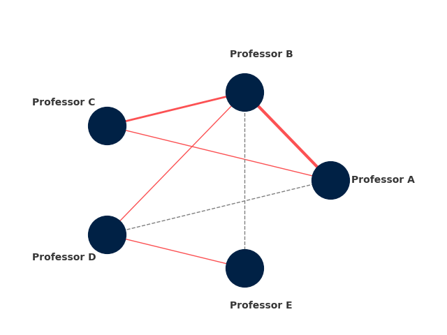
I assigned professors in a given project academic names (Professor A, B, etc., in this example) and represented them as nodes in a graph (the blue disks). With the help of a colleague, I obtained a database containing all the papers of the institute’s members. I then wrote a script to filter this database, creating a list of pairs of names whenever two professors co-authored a scientific publication. These pairs were represented as red edges on the graph, symbolizing collaboration—instances where individual members joined efforts to address a single problem. To depict the strength of collaboration, the thickness of the red connections was made proportional to the number of papers two researchers co-authored. The more papers they shared, the stronger their collaboration!
Now how could I create a sense of “where this program is going”? I decided to examine sub-projects proposed in the program. As these involved multiple groups, I created a list of “collaborations in development.” If an edge didn’t exist between two professors but collaboration was underway, I depicted it as a dashed line. The web of dashed lines indicated the program’s capacity to foster a more robust collaborative network, paving a path to make the institute “more than the sum of its parts.” For reporting and tracking, once a publication came together, boom! The list of publications could be updated, the dashed line would become red, and one could visualize the change in the network directly.
Of course, these are all qualitative ways of looking at the problem. But again, graph theory is a well-established branch of mathematics. There are several quantities one can use to obtain quantitative information on the state of one such network. Here go a few I like:
Degree Distribution: the distribution of degrees (number of connections) can provide insights into the connectivity of the network. In our academic network, we would be looking at the number of collaborations each professor has.
Reports with these data could then be generated for analysis. I habitually provided reports on the “current state” of the network (i.e., without the dashed lines), and “target state” (including the dashed lines) for comparison. These can be plotted in bar charts and set up thes side-by-side for analysis. For example, for the mock data of the graph above, we would have
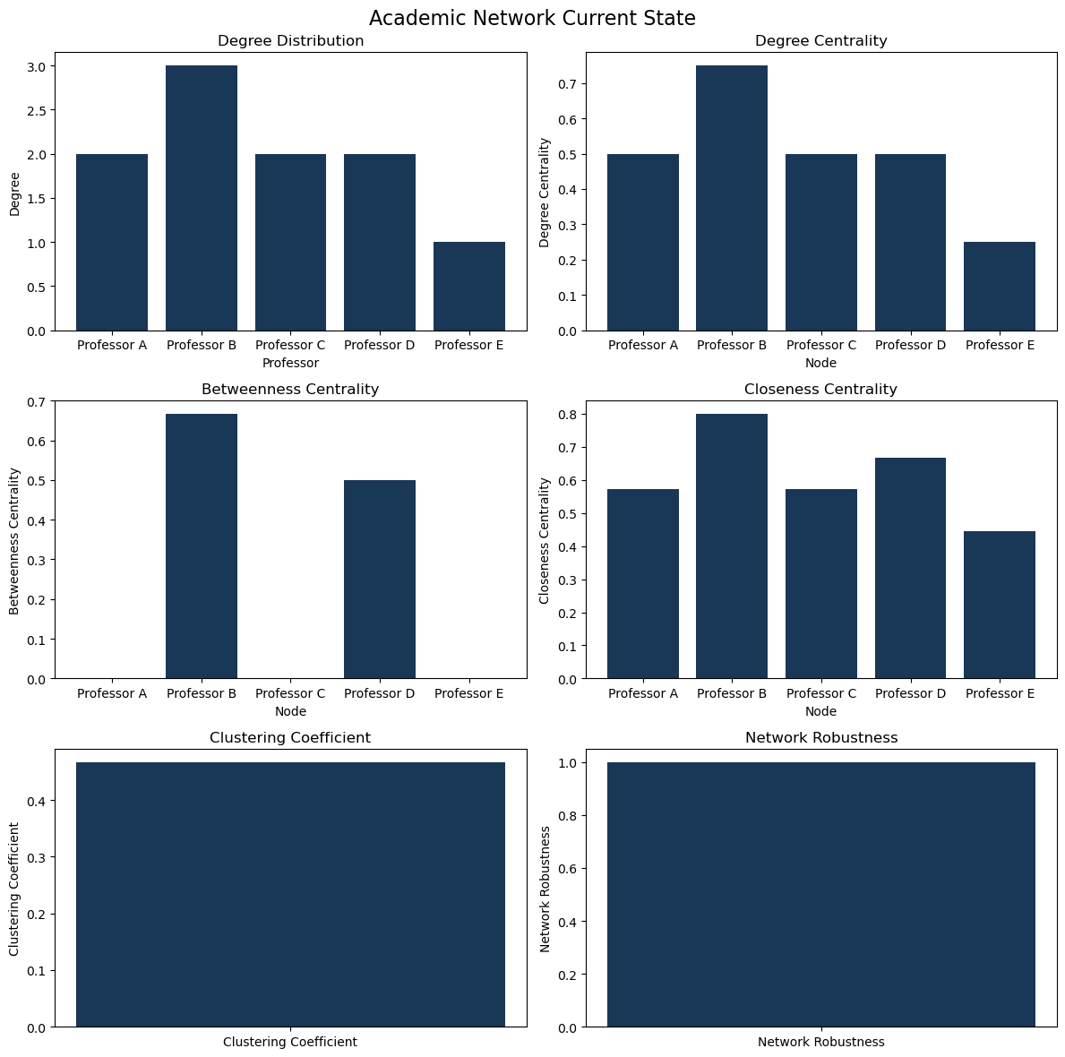
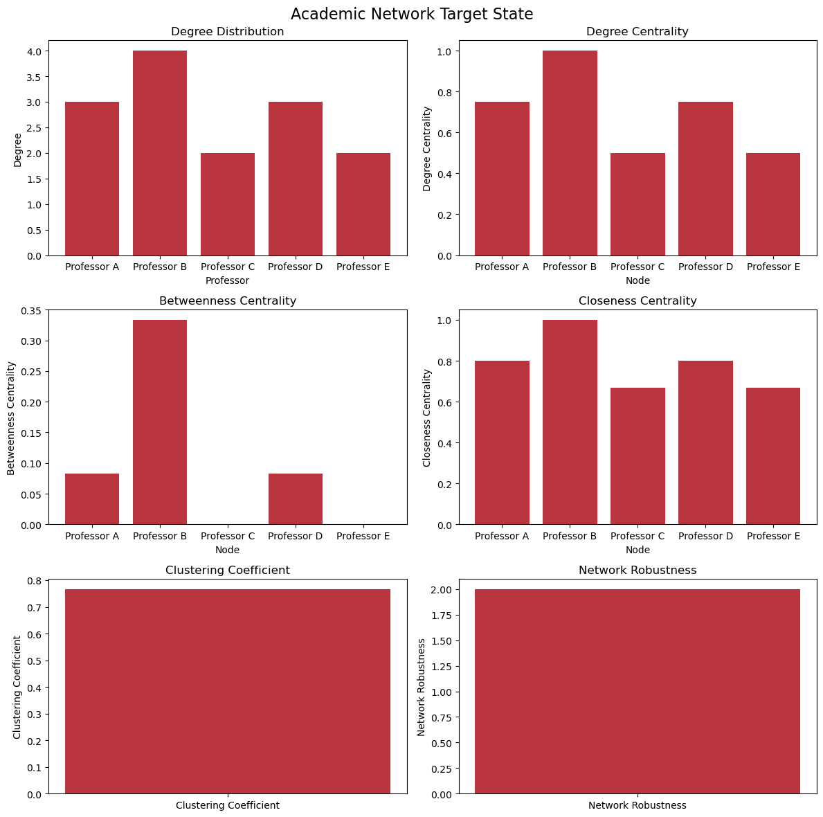
Though there’s room for improvement—for example, plotting both on the same axes for easier comparison—the tool proved effective. It not only structured early program reporting but also aided researchers in grant applications, helping secure nearly seven-figure funding. While the solidity of research programs was the main driver of such success, I am happy I could play a small part in this achievement.
Managerial teams are not always equipped to program tools like this, nor to determine suitable graph-based metrics. I’ve heard that reproducing what I initiated with these networks became challenging after my departure from the Stewart Blusson Quantum Matter Institute. Recently, with renewed energy, I revisited my code and polished it to make it easier to reuse and share. If you are interested in trying it, you can find what I hope is a straightforward codebase on this Github repo. Once you’ve successfully generated your data, running
python research_network_analyzer.py
will generate figures of your network, plots with data analysis, and text files with numerical report data for both the current and target states of your network. As mentioned above, there is space for improvement, but I hope this can now be useful to more people!
And with that, the story—or perhaps this chapter—ends. The Grand Challenges program is ongoing, and research there continues to thrive. Many former researchers who participated in the program have moved on to prominent positions in academia and industry. Likewise, my journey to improve managerial practices in research environments continues to evolve.
Book Review – Improving How Universities Teach Science (Carl Wieman)
Back to book reviews! The backlog is growing!
This post is a long one in the making. I should dedicate it to my wife, as this has been a family project running for years. We will divert from science mana...
Short post inspired by a big lesson. Recently I was in a conference and me and other scientists were discussing how easy or hard it was to get strong perform...
What better way to start the new year than with Words of Wisdom? For the second installment of our blog series featuring interviews with science managers, we...
Through fall season, Harvard hosts a Science & Cooking course, where science topics relevant for cooking such as soft matter, organic chemistry, heat tra...
Basic project management often begins with a charter—a set of agreements that define the rules and expectations for team collaboration. I believe a team char...
Lazy blogging. I don’t want to reblog a topic someone else just did. So I will just point people to this interesting piece on should students teach? at Conde...
In my journey to expand my knowledge from physics to effective management practices, I maintain a steady, yet unhurried reading pace. I find the experience e...
Recently I have written posts on the challenges and subtleties of keeping a healthy funding stream for a scientific team. We have also covered some creative ...
As a research manager, securing stable funding for your group is a critical responsibility. Your team, whether students or professionals, relies on you as th...
Starting a new blog series at Set Physics to Stun! While most of my posts are based on my own experience, observations, or creations in science and scientifi...
A (total!) eclipse, travel, and hackathons have slowed down my blogging. That together with, for the first time, being asked to do the technical review of a ...
A busy week of teaching and preparing for an upcoming trip to Quebec to witness the eclipse left little time for blogging. Nonetheless, I’ve been mulling ove...
This post tells a bit of my own professional story as I left life as a pure researcher, and then moves toward introducing my first managerial tool for scient...
As I keep trying to create technical content, columns on Nature continue to interrupt me. Seems like these really are good sources of inspiration.
While I was working on a much more technical first post, Nature released a News article on a core raison-d’être of this blog: the trust of public in scientis...
This is it, I can’t believe I am finally starting this! Welcome to “Set Physics to Stun”, my blog on physics, scientific management, and other topics relevan...